Jun 10 2017
Alternative Certificate Interface
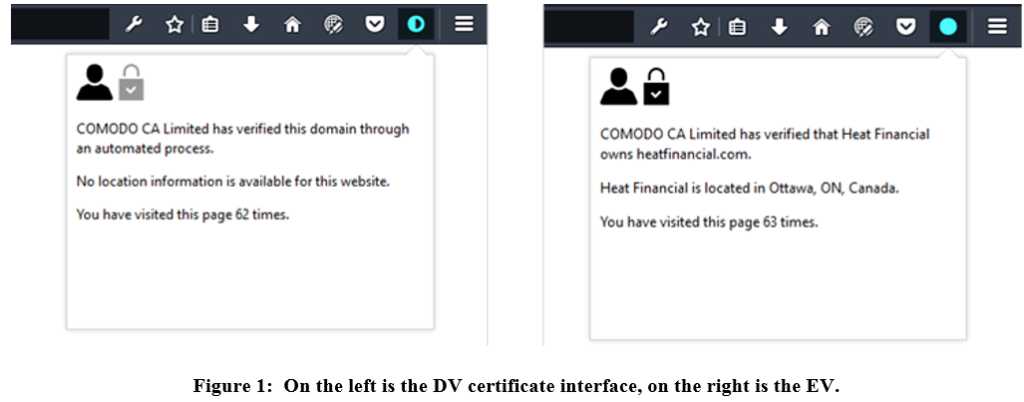
INTERFACE
The interface design was intended to be simple and straightforward (Fig. 1). The indicator is a circle that would be empty to represent no certificate, half-full to present a DV certificate, and full to present an EV certificate. The circle fits into the space provided by the browser and is a noticeable size without being obtrusive. The analogy of the half-full circle is meant to demonstrate that the DV certificate has encryption but not identity.
STUDY DETAILS AND RESULTS
Nineteen participants volunteered to participate in a semi-structured interview assisted by the certificate extension interface. Participants were asked to identify the identity of a website.
After the participant had described their perception of the website, the interviewer would redirect their attention to the top of the browser where the security icons would be shown. Our interface was available via a button on the browser tool bar. None of the participants saw it without prompting, but this is a limitation of any extension. When they were prompted to access the interface, they did engage with the information presented.
Two participants who saw the DV certificate interface first, where the lock with check mark icon was greyed out, said that it appeared a step was missing and verification was not complete. In our certificate interface, the address text for a DV certificate read that “no location information is available,” instead of the current practice of leaving the area blank. This was one cause for participants to be wary of DV certificates on websites they are using. Most participants commenting on the lack of an available address demonstrates that the participants noticed that information was missing. Including this text can help the user make informed decisions; they can decide whether it is acceptable that the address of the organization is unknown. Including the organization’s address as part of the certificate interface can also assist a user to detect a fraudulent website when the actual address on the interface does not match the expected address. One participant commented that they would be hesitant to use this website if they knew the bank’s address was in Toronto (the bank headquarters) but the certificate address read Ottawa (where they lived). This strongly suggests that the interface is helpful in illustrating that indeed some information is missing: identity has not been verified. It also suggests that precision is needed in explaining the address.
Users found that the number of previous visits was the most useful tool for determining whether to trust the website. Participants appear to be reassured by a high visit count and it confirms that this is a website they are used to using. One participant commented, “since I visit this page a lot, I wouldn’t need to check the certificate.” The browser extension interface could be improved by placing the visit count higher, where users are more likely to see it. The previous visit count could possibly be incorporated into the indicator. This would have to be done very carefully to keep the meaning of the indicator clear. However, the visit count would not help defend against a compromised website. Thus, we recommend that some form of user education on web certificates be developed to aid users in understanding what elements can help them properly determine identity.